

Have you ever walked into a home and instantly felt relaxed, welcomed and completely at ease? Sometimes, it is not the size of the rooms, the layout or even the furniture that creates that feeling. It is the colours surrounding you! When preparing a property for sale, choosing the right colours that appeal to home buyers can make a remarkable difference to how people experience a home. From soft coastal neutrals and warm whites to calming greens and timeless earthy tones, the right colour palette can make a property feel brighter, more spacious and incredibly inviting. But with so many beautiful shades to choose from, which colours are most likely to capture buyers’ hearts?
Why Colour Can Influence a Buyer’s First Impression
Colour has an incredible ability to shape the atmosphere of a home. The moment someone steps through the front door, they begin forming an impression of the property, often before they have properly explored the floorplan or noticed all the finer details. A bright, beautifully balanced colour scheme can create a wonderful sense of openness, while an overly dark or busy palette may make certain spaces feel smaller or more enclosed.
When selecting colours that appeal to home buyers, the goal is to create an environment where people can imagine their own furniture, belongings and lifestyle fitting naturally into the space. This is one of the reasons neutral colours are so popular in real estate marketing. They provide a versatile foundation that allows architectural features, natural light and beautiful furnishings to take centre stage.
However, choosing neutral colours certainly does not mean a home needs to feel plain or lacking personality. In fact, some of the most memorable interiors combine understated walls with beautiful textures, natural materials and carefully selected accent colours that make each room feel warm and welcoming.
The Timeless Beauty of Warm Whites
There is something effortlessly beautiful about a home filled with soft, warm whites. Unlike stark, brilliant white, which can sometimes feel clinical, warmer shades create a gentle and inviting atmosphere that works beautifully in both modern and traditional properties.
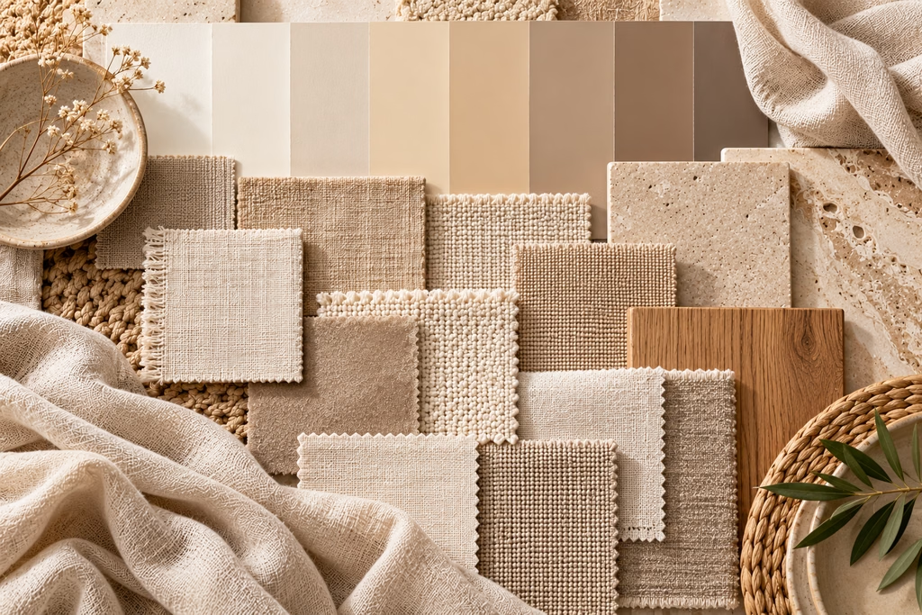
Warm whites are among the most versatile colours that appeal to home buyers because they complement a wide range of furniture styles, flooring materials and interior finishes. Whether a home features polished timber floorboards, contemporary tiles, stone benchtops or natural woven textures, a warm white backdrop can help bring everything together.
These colours are particularly appealing in living areas, kitchens and open-plan spaces where buyers want to see plenty of natural light. They can help rooms feel fresh and spacious while allowing attractive architectural details to stand out.
In coastal locations such as Hervey Bay, warm whites also work beautifully with the relaxed lifestyle that so many buyers are searching for. Imagine an inviting living room with flowing curtains, beautiful timber furniture, textured linen lounges and sunlight streaming through large windows. It is simple, elegant and timelessly appealing.
Why Beige, Greige and Earthy Neutrals Are Making a Comeback
For years, cool grey interiors dominated modern home design, but warmer tones have become increasingly popular as homeowners embrace spaces that feel more natural, comfortable and connected to their surroundings.
Soft beige, taupe, greige and gentle earthy shades offer an inviting alternative to traditional white walls. These tones introduce subtle warmth without overwhelming a room, making them excellent colours that appeal to home buyers who appreciate contemporary style with a softer finish.
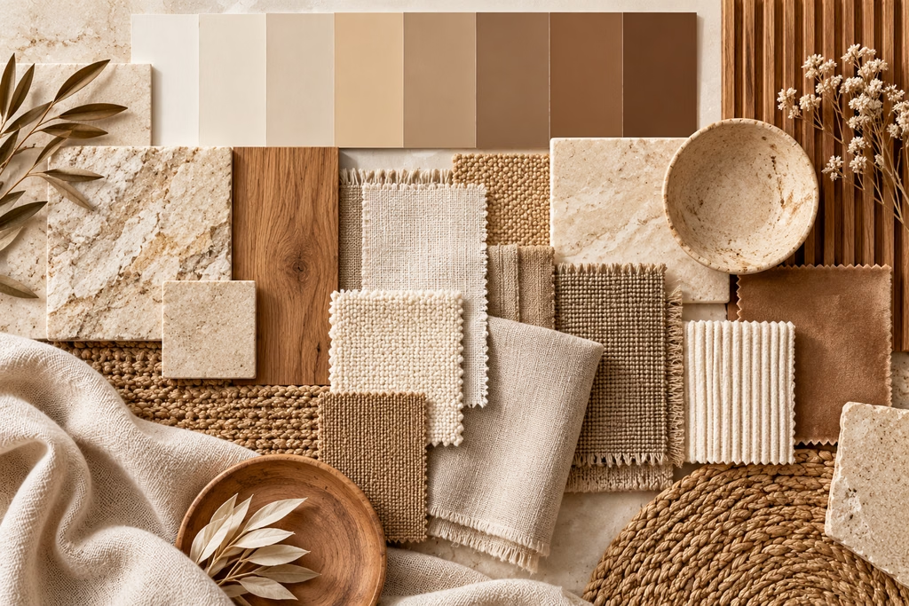
Greige, which combines elements of grey and beige, is particularly versatile because it can complement both warm and cool interior finishes. It works beautifully with timber flooring, light cabinetry, stone surfaces and a variety of decorative accents.
Earthy neutrals can also help create a sense of continuity throughout a home. Using similar tones across living spaces, hallways and bedrooms allows rooms to flow naturally into one another, giving the property a cohesive and considered appearance.
For buyers, this can make a home feel beautifully presented and easier to personalise without needing to make immediate decorative changes.
The Irresistible Appeal of Coastal Colours
When it comes to Hervey Bay real estate, coastal-inspired interiors have a special kind of charm. Soft sandy tones, gentle blues, muted greens and beautiful natural textures reflect the relaxed atmosphere of living near the water.
Coastal colour palettes are particularly effective because they create a feeling of tranquillity without needing to rely on bold or overly decorative finishes. A combination of warm white walls, sandy beige furnishings, pale timber and subtle blue accents can make a home feel fresh, light and effortlessly welcoming.
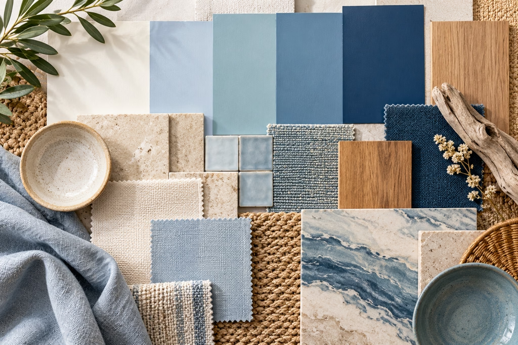
For properties located close to the Esplanade, beaches or picturesque waterways, these shades can also help reinforce the lifestyle that buyers are hoping to enjoy. Even homes positioned further inland can benefit from a coastal-inspired palette that celebrates natural light and easy indoor-outdoor living.
The key is subtlety. Rather than filling every room with bright blue walls and nautical decorations, consider using colours that appeal to home buyers through carefully balanced layers. A soft blue cushion, textured throw, pale green artwork or natural timber feature can introduce coastal personality while keeping the overall presentation elegant and versatile.
How Soft Greens Create a Beautiful Sense of Calm
Green has become an increasingly popular choice in contemporary interiors, particularly softer shades inspired by nature. Sage, eucalyptus, muted olive and gentle grey-green tones can bring warmth and character into a space without feeling overwhelming.
These shades work especially well in bedrooms, bathrooms and quiet living areas where a peaceful atmosphere is desirable. Paired with warm whites, natural timber and neutral furnishings, soft green can create a beautiful connection between indoor and outdoor spaces.
In Queensland, where lush gardens, tropical landscaping and outdoor entertaining are such an important part of everyday living, green-inspired interiors can complement a home’s natural surroundings.
While not every buyer will love a green feature wall, muted green accents can provide a refreshing alternative to an entirely neutral palette. Introducing these shades through cushions, artwork, indoor plants, bedding or decorative accessories allows sellers to create visual interest without committing to dramatic permanent changes.
When used thoughtfully, these are colours that appeal to home buyers who appreciate relaxed, nature-inspired styling.
Should You Avoid Bold Colours When Selling?
Bold colours can be exciting, expressive and full of personality, but they can also be quite divisive when selling a property. A dramatic red dining room, bright purple bedroom or striking yellow kitchen might perfectly reflect the current owner’s taste, yet some buyers may struggle to picture how their own furniture and style would work in the space.
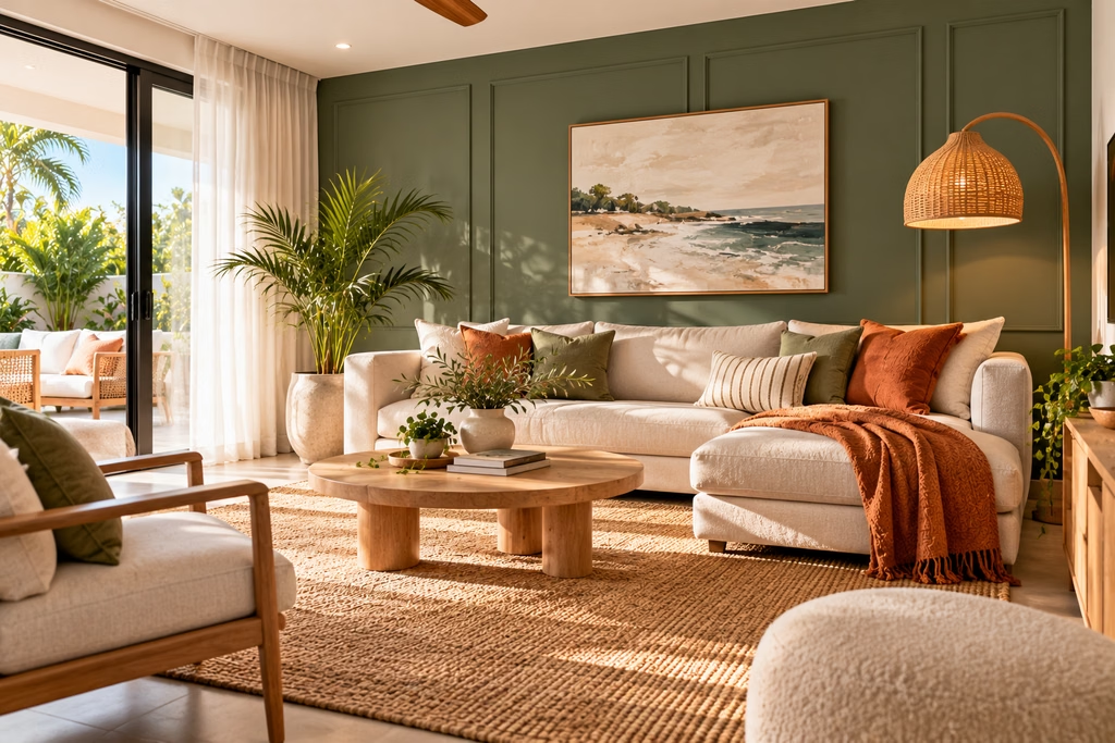
This does not mean every home needs to be stripped of colour. In fact, distinctive character can be a major selling point, especially in beautifully renovated homes or properties featuring unique architectural details.
The secret is knowing where to introduce stronger colours and where to keep things more understated. Rather than painting every wall in a bold shade, consider adding personality through artwork, cushions, decorative accessories or carefully chosen furnishings.
A beautifully styled room with neutral walls and a striking piece of art can feel far more memorable than a completely empty space. Likewise, a sophisticated navy front door, deep green cabinetry or thoughtfully designed feature wall may enhance the home’s overall presentation when it complements the architecture.
The most effective colours that appeal to home buyers are not necessarily the safest shades in every situation. They are the colours that help showcase the property at its very best.
Why Exterior Colours Matter Just as Much
While interior colours play an important role in creating a welcoming atmosphere, the exterior of a home is often responsible for making that all-important first impression.
Before buyers even reach the front door, they have already noticed the home’s façade, roof, landscaping and overall street appeal. A beautifully coordinated exterior colour scheme can make a property feel modern, well-maintained and attractive from the moment someone arrives.
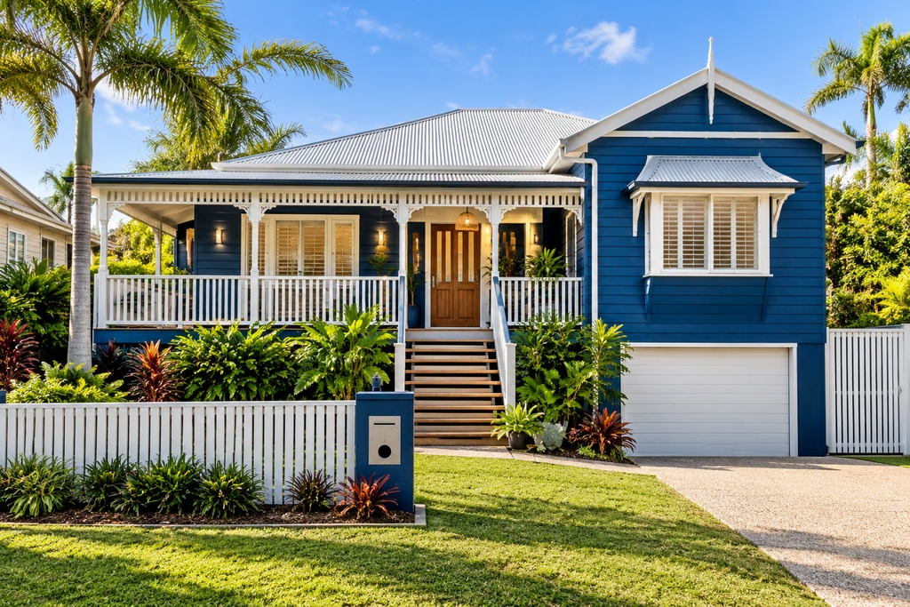
Warm whites, soft greys, gentle beige tones and muted coastal colours are popular choices for many Australian homes because they complement natural surroundings and a wide variety of building materials.
For traditional Queenslander homes, classic light colours paired with contrasting trims can highlight decorative timber features, verandahs and beautiful heritage details. Modern coastal homes, on the other hand, may look particularly appealing with warm neutral render, timber accents and understated darker features.
It is also important to consider existing roofing, brickwork, fencing and landscaping before choosing a new exterior colour. A coordinated palette can be more appealing than selecting a fashionable shade that does not suit the property.
How the Right Colours Can Make Rooms Feel Bigger and Brighter
One of the most valuable things a seller can do is help buyers appreciate the sense of space within a home. While paint cannot physically change the dimensions of a room, certain colours can influence how open, bright and comfortable it feels.
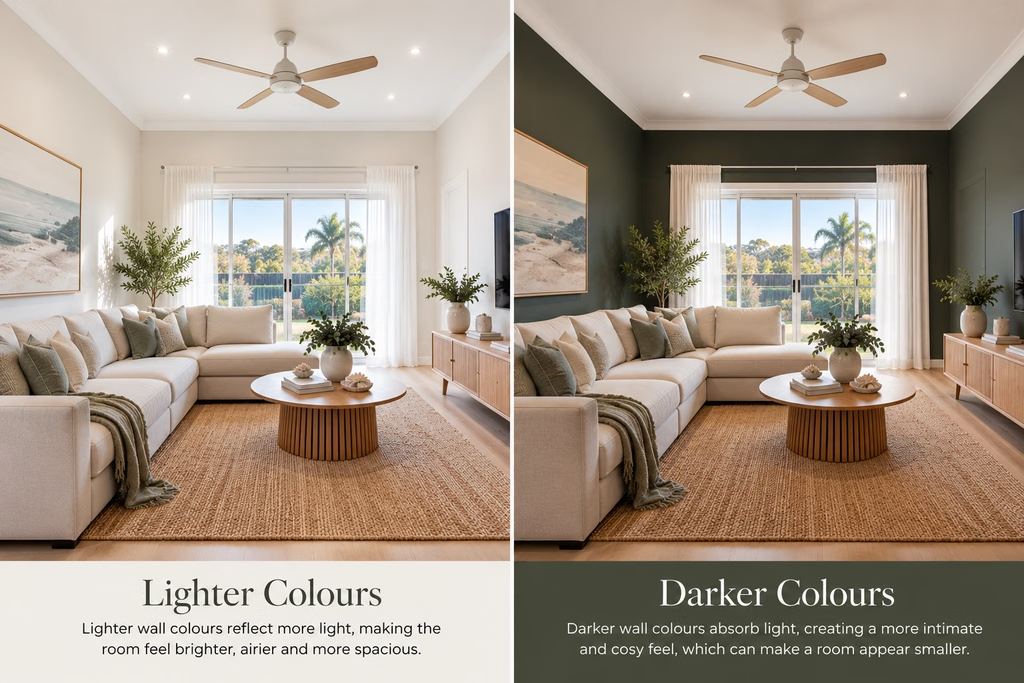
Light colours generally reflect more available light, making them particularly useful in smaller bedrooms, hallways and living areas with limited natural sunlight. Soft whites, pale beige and gentle neutral tones can help brighten darker spaces and create a more consistent appearance throughout the property.
Using similar shades on walls and ceilings may also reduce strong visual contrasts, helping certain rooms feel more open and connected. This can be especially effective in compact homes, apartments and properties with smaller floorplans.
However, natural lighting conditions should always influence colour selection. A shade that looks beautiful in a bright north-facing room might appear quite different in a shaded bedroom.
Before committing to a particular paint colour, it is worth testing samples in different areas of the home and viewing them throughout the day. The best colours that appeal to home buyers should complement the property’s actual lighting and finishes, rather than simply looking attractive on a colour chart.
Creating an Emotional Connection Through Colour
Perhaps the most fascinating thing about colour is its ability to influence how a property feels. Buyers are not simply searching for bedrooms, bathrooms and square metres. They are imagining the lifestyle, memories and experiences they could enjoy within those spaces.
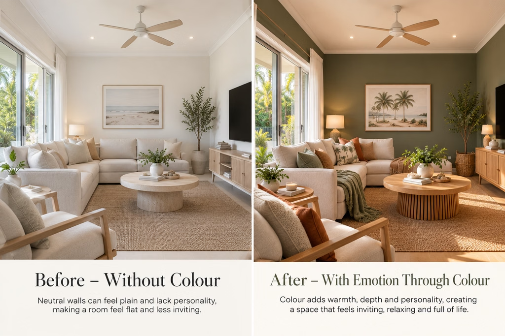
A warm, inviting living room may help buyers picture family gatherings and relaxed evenings together. A beautifully styled bedroom in gentle neutral tones can create a peaceful atmosphere, while a fresh coastal kitchen might bring to mind weekend breakfasts and entertaining friends.
This emotional response is an important part of the property inspection experience. When a home feels welcoming and beautifully presented, buyers may find it easier to imagine themselves living there.
Choosing colours that appeal to home buyers is therefore about much more than following the latest interior design trends. It is about creating a sense of comfort, possibility and connection.
Is Repainting Worth It Before Selling?
If you are preparing to place your property on the market, you may be wondering whether repainting is worth the time and expense.
The answer depends on the condition, style and presentation of your home. If the walls are already in excellent condition and the existing colours complement the property, a complete repaint may not be necessary. Sometimes, a thorough clean, minor touch-ups and carefully chosen styling accessories can make a significant difference.
However, if walls are heavily marked, colours are particularly outdated or different rooms feature competing colour schemes, a fresh coat of paint may be a worthwhile improvement.
Before investing in major cosmetic changes, it is always sensible to consider your property’s likely buyer demographic, price range and competing listings. A beautifully presented family home may require a different approach from a luxury coastal residence, traditional Queenslander or low-maintenance investment property.
The aim is not necessarily to create a brand-new home. It is to highlight the property’s existing strengths and present it in a way that resonates with the broadest suitable audience.
The Secret to a Home Buyers Cannot Forget
When it comes to choosing colours that appeal to home buyers, the most successful approach is often a beautiful balance between timeless style, warmth and individuality.
Soft whites, elegant beige tones, calming greens and gentle coastal colours can all help create an inviting environment, particularly when complemented by natural textures, attractive furnishings and plenty of light.
But above all, the right colour palette should suit the home itself. A beautiful character property, modern family residence and contemporary coastal apartment will each have their own personality, and the most effective styling choices will celebrate what makes them special.
If you are considering selling your property in Hervey Bay, the team at Carter Cooper Realty understands how important presentation is when attracting buyer interest. From highlighting standout features to helping your home make a memorable first impression, thoughtful preparation can play an important role in a successful marketing campaign.
Because sometimes, making buyers fall in love with a home starts with something as simple as choosing the perfect colour!